cover iterations
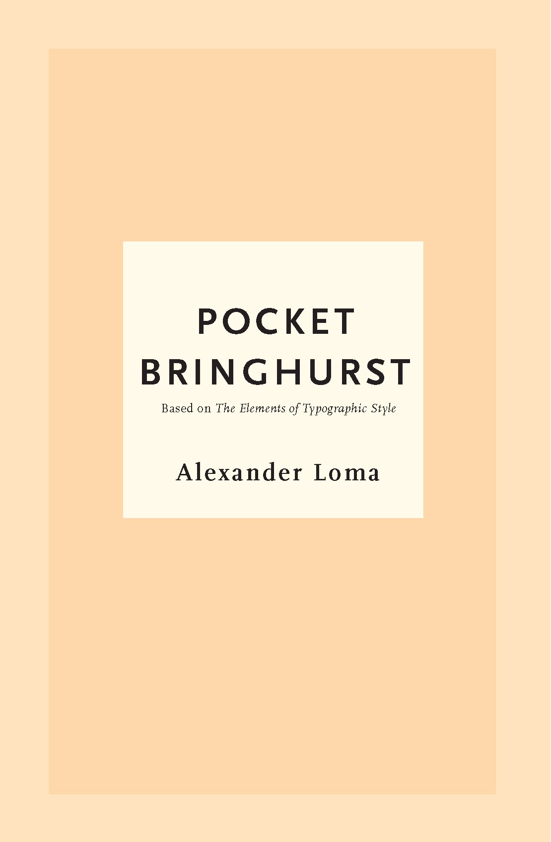

The front covers of the Penguin Random House MLC and Simon & Schuster editions of Shakespeare inspired my initial concepts for Pocket Bringhurst. These elegant, simple, yet striking covers drew me in quickly, and I initially hoped to capture the reader's eye with the same elements.
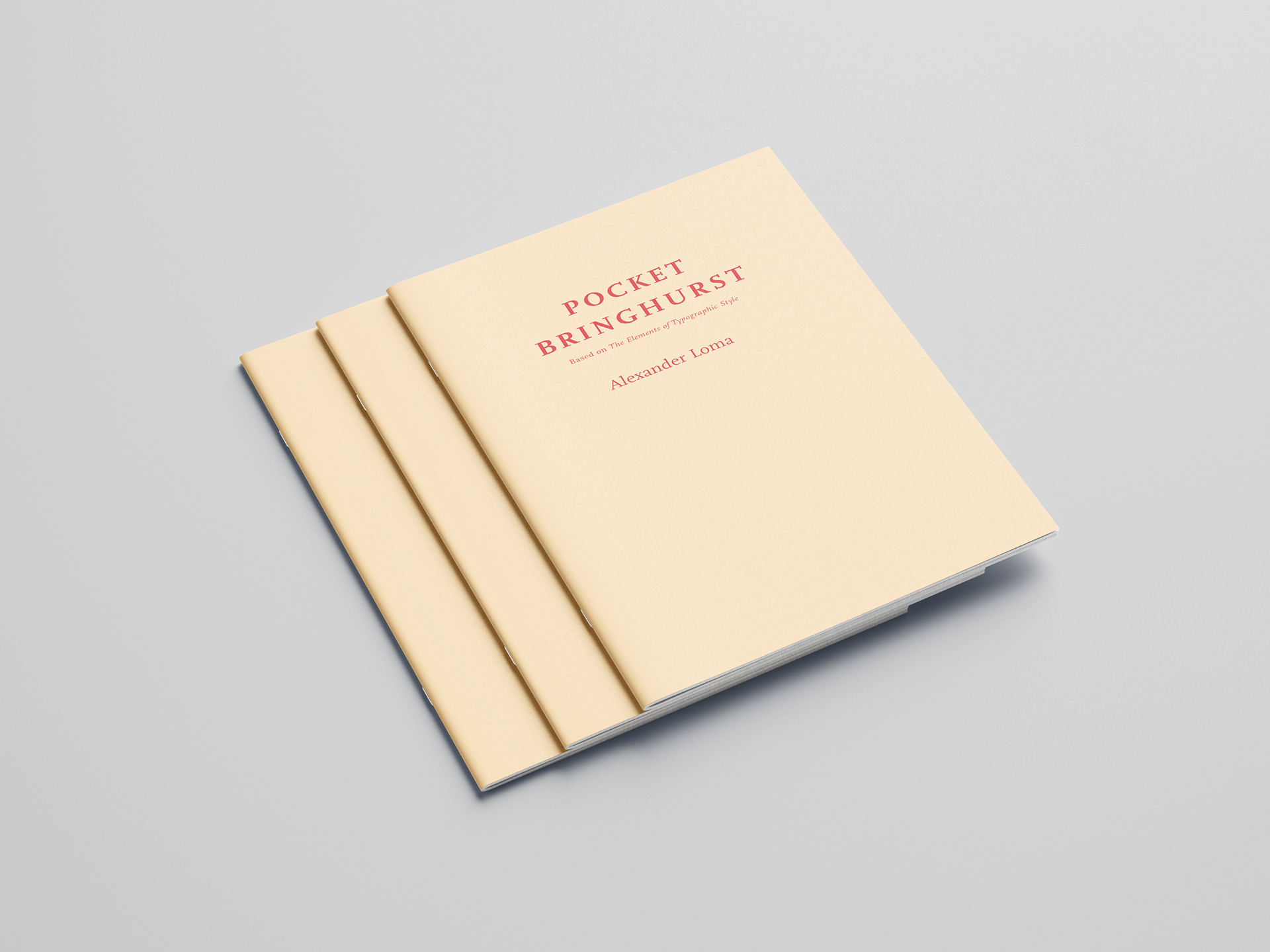
With that focus on typography and simplicity, I changed course, challenging myself to execute the final design using only typography and color. Red and yellow are colors well known for capturing a viewer's attention immediately, so I chose both to create a simple full cover, as someone who appreciates minimalism in design.
Various Pages
Half-Title
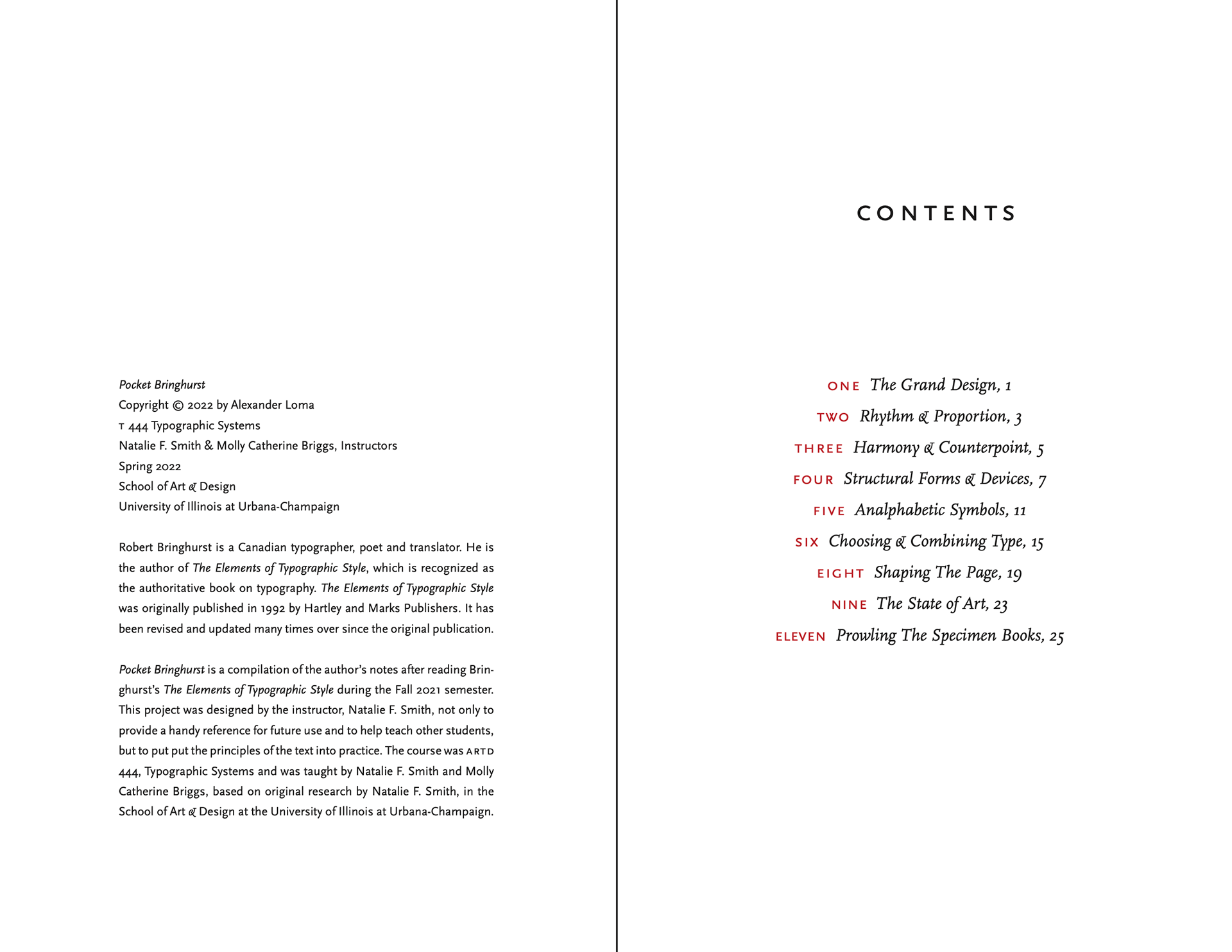
Copyright Page and Table of Contents
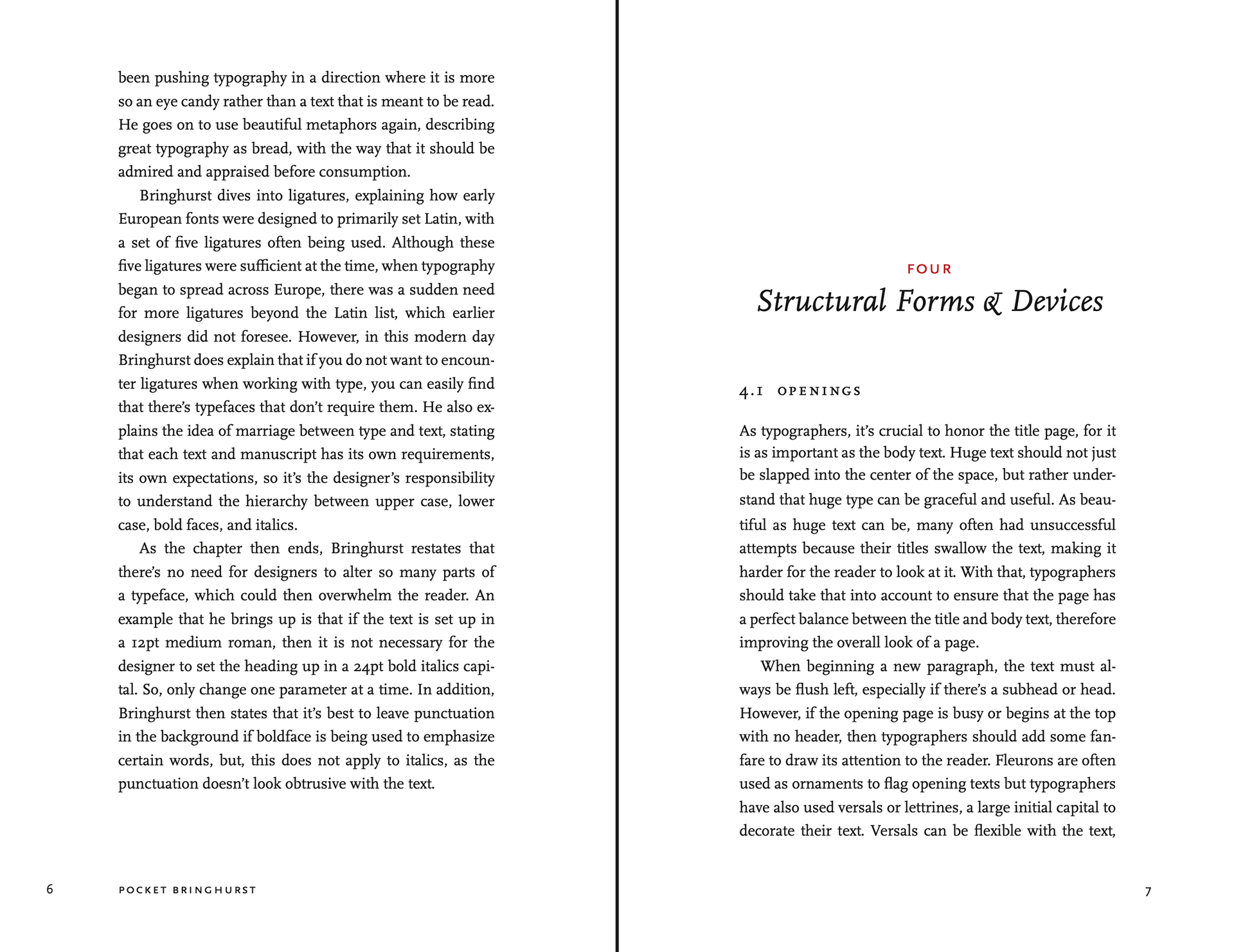
Pocket Bringhurst Chapter 4
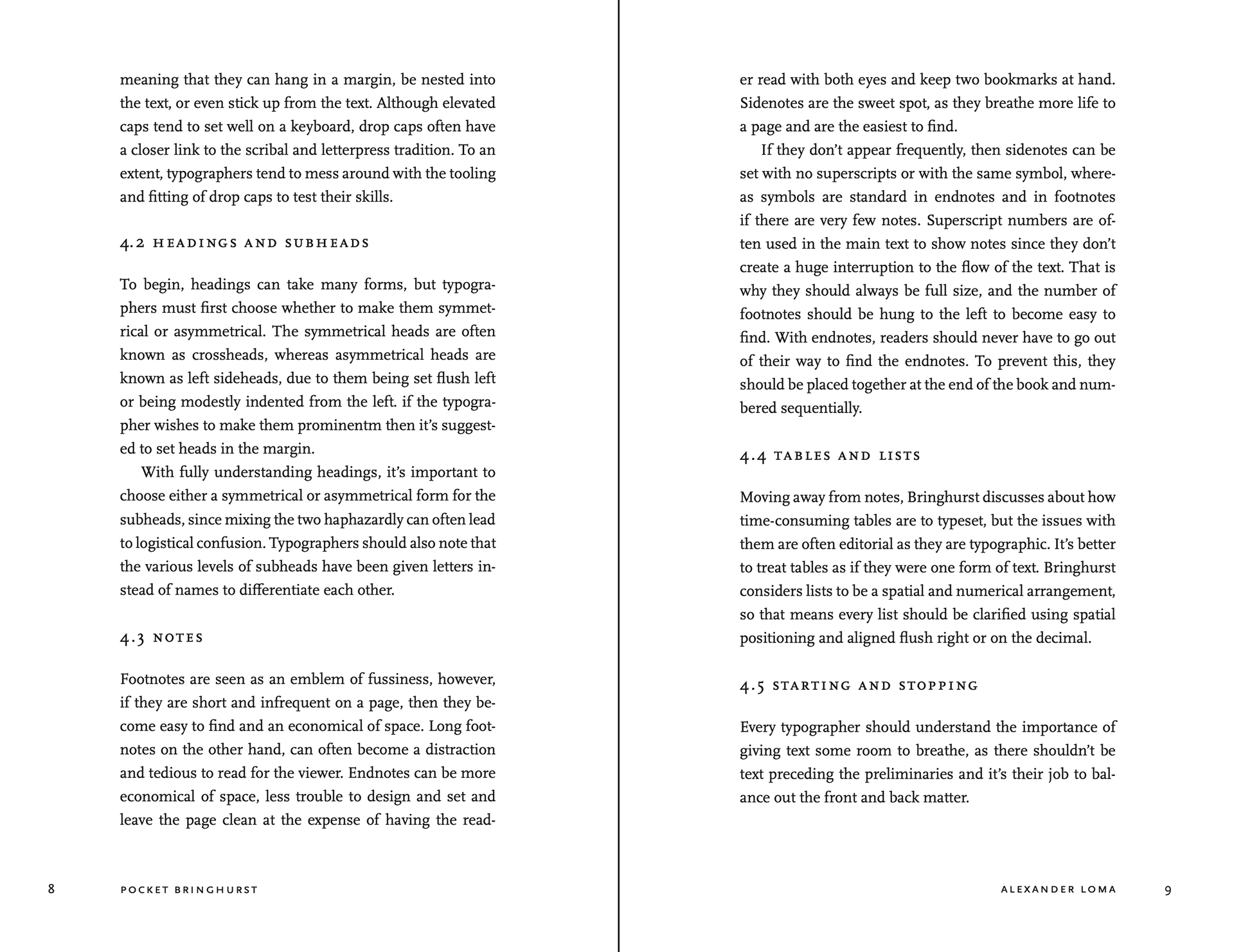
Pocket Bringhurst Chapter 4 (continued)
Background
In a year-long typography course, I would learn more about complex typographic systems through course material, various practices, and reading Robert Bringhurst's The Elements of Typographic Style.
Challenge
Applying the typographic skills learned from the course, create a booklet using the short summaries written from reading The Elements of Typographic Style.
Audience
People who have never read The Elements of Typographic Style before and are attempting to familiarize themselves with typography and its complex systems.
Solution
I typeset my chapter summaries in Adobe InDesign while applying the knowledge I gained throughout the course.
From concept to printing, I designed the front matter for Pocket Bringhurst, aiming for a simple yet modern look. I typeset a document at the end, reflecting on my growth throughout the year.